

|
| from Clocks Magazine, October 2006 |
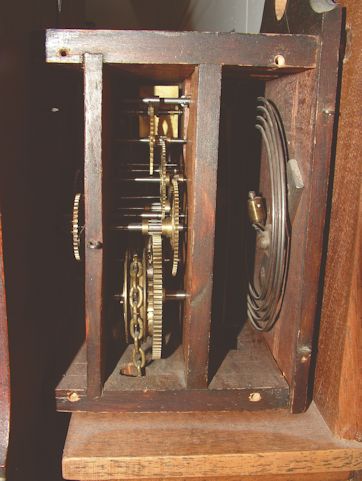
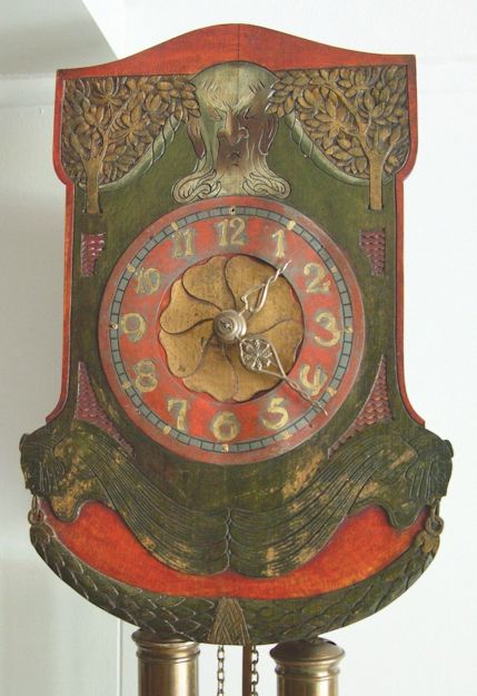
Black Forest Jugendstilby Doug Stevenson, USADownload a pdf of this article The seemingly invincible myth that cuckoo clocks were the be-all and end-all of Schwarzwald clockmaking is an irritant, no doubt. But of itself its a minor affair, a horological no-no. It does nevertheless have an undesirable side effect. Cuckoos tend to be over-represented and especially so in some North American publications. This cuckoo-eyed bias both feeds the myth and leads to other types being under-represented, or not represented at all. Yet it is on the Black Forest paths less taken that the beginner can often still find interesting and affordable clocks, and perhaps build a collection around them. A friends clock from around 1900 brought such thoughts to mind, figure 1. It has a carved and painted shield-style wooden dial in what in the German tradition was termed the new, modern or Jugend style. Behind it is a standard, not to say stolid, wood-plate movement, figure 2. The shields colours have hardly darkened over the past century, and it still has a cheerful mien, an optimistic turn-of-the-century look which, looking back, might now seem a bit naïve, figure 3. Jugendstil and its Art Nouveau and Modern Style kin support an extensive literature. Its generally agreed that the German term stemmed from an art magazine Die Jugend (the youth) which appeared in Munich in 1896, that the movement reached its artistic maturity round 1900, and that by 1909 or so the style had already drooped if not died. 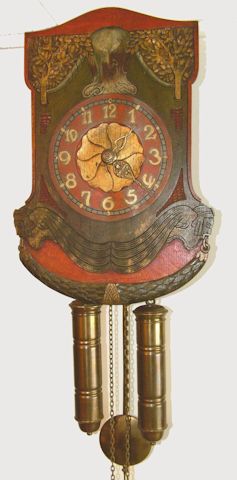
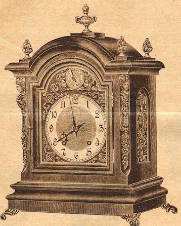
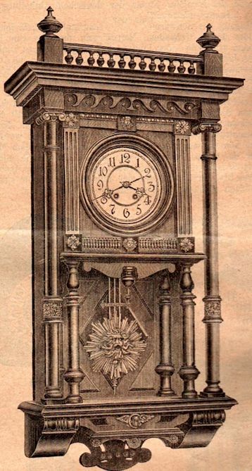
Some art critics of the era, some modern critics point out, were predictably displeased by how rapidly Jugendstil was commercialised. Designs were mass-produced by less than aesthetic interests who were just outharrumph!to a make a Reichsmark. But as will be seen later, those who were supposedly just out to make their mark in art were sometimes criticised too. Jugendstils effect on clocks has been approached in the horological literature although on a far smaller scale. Well over a dozen individual clocks designed by artists are shown in Klaus Maurices (1976) Die Deutsche Räderuhr, for instance. We can also mention the 1996 volume, Clocks of the Art Nouveau and Art Deco Style 1890-1940, an admirable effort by nawccs Chapter 28 in Ohio. The more specific Black Forest horological literature also treats Jugendstil. Helmut Kahlerts Bibliographie zur Schwarzwalduhr lists three references. One is his own 1994 article Zeitmesser im Jugendstil which appeared in the popular German magazine Trödler. Then theres something rather different and far less known. It might be called a primary secondary source. Its an article in the 15th August 1900 issue of the Deutsche Uhrmacher-Zeitung that described and discussed the Black Forest clockmakers displays at the 1900 Exposition Internationale Universelle de Paris. It was illustrated by a set of high-quality drawings. The article, written by editor Wilhelm Schultz, was the eighth in a series reporting on all things horological at the Paris Expositon. Through it we can view some Black Forest offerings in Jugendstil from the time when they were being presentedfrom when they were still young. At the same time we have a contemporary and knowledgeable commentary on them. The article did not attempt to cover all the offerings of all the Schwarzwald exhibitors. Schultz started off by stating that individual offerings could naturally only be mentioned in passing. Because of this we want to concentrate on the major things which are in some way special. Especially those which incorporate den modernen Styl, what Schultz elsewhere also termed Jugendstil (but spelled as Jugend-styl or Jugendstyl). Schultz still managed to offer a nod or two to a bakers dozen of Black Forest manufacturers. In order, these were Philipp Haas & Söhne, C Werner, Gebrüder Wilde, J M Mauthe, Josef Schmidt, Gustav Schyle, Gordian Hettich Sohn, Emilian Wehrle & Sohn, the Jahresuhrenfabrik GmbH, August Schwer, the Victoria Clock Co A Maier, the Uhrenfabrik vormals L Furtwängler Söhne A-G, and the Firma Friedrich Mauthe aus Schwenningen (Württemberg), Bregenz (Oesterreich), und Allensbach (Baden). Only five of the 13 firms were represented by illustrations among the total of 18 the duz published: Haas, Werner, Maier, Fürtwängler, and Mauthe. Werners two illustrations were of a solid clock that was intended for England, figure 4, and one for France, figure 5. Neither design was overly youthful so both will be passed by here. Four clocks displayed by Philipp Haas & Söhne of St Georgen, by contrast, were specifically termed hochmodern, ultra-modern, and described at some length. All four were eight-day and chain driven, figures 6, 7, 8 and 9. 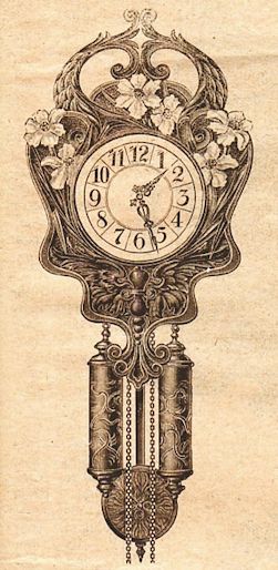
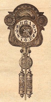
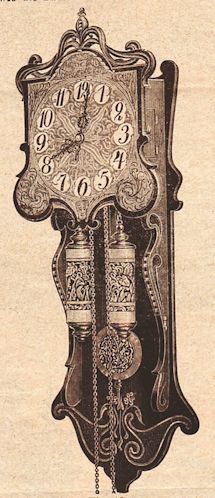
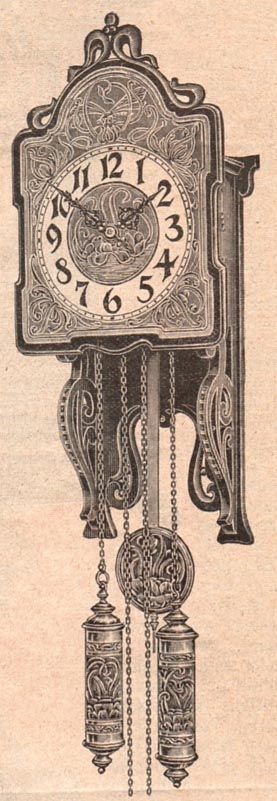
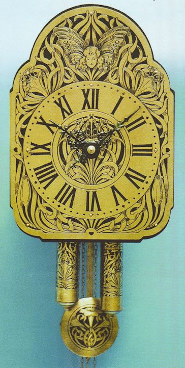
The first clocks shield was of richly carved jacaranda. Its daffodils of white and yellow had red filaments. Some of the leaves were green. An additional effect came from the matt silver colour of the dial proper, the pendulum and the weights. The second clock had a dial of carved oak which fit well with the bright stylised sunflowers. The dial, pendulum and weights were of etched zinc. The other two Haas clocks which were illustrated, figures 8 and 9, had the same type movements and shield-style dials. Schultz however felt that because their cases were formed as freeswingers (Freischwinger was in quotes to indicate a so to speak sense) they reminded one more of regulators. The first of the pair was 1m high and came in two versions. One was in jacaranda, the other stained green with gilt highlights. Hands, dial and weights were etched and silvered. The case of the second of the pair, which was only 66cm high, was a polished green whereas the dial, pendulum and weights were copper-plated, except for the chapter ring which was a matt silver. Schultz described other Haas exhibits that were not illustrated in the duz article. He considered the smaller clocks which had shields of metal and Schotten-type movements to be worthy of note. They were also in the newest style and had black backgrounds to various metal-coloured (eg silver, brass, copper) ornamentation with matched dials, pendulums and weights. What appears to be a larger version of one such clock can be seen in figure 10. The photograph comes from the Clocks of the Art Nouveau and Art Deco Style volume mentioned above. The clock is identified as being from Philipp Haas, with etched brass, from c1900. After polite nods to the offerings of several other firms, Schultz then described the large selection of wall clocks with shields im Jugend-styl which were displayed by the Victoria Clock Company A Maier of St Georgen. Four of these are illustrated, figures 11, 12, 13 and 14. 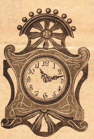
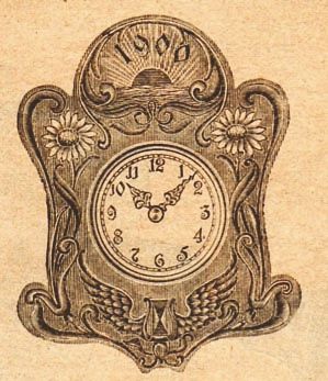
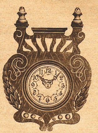
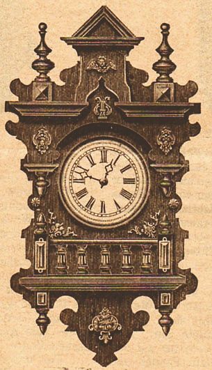
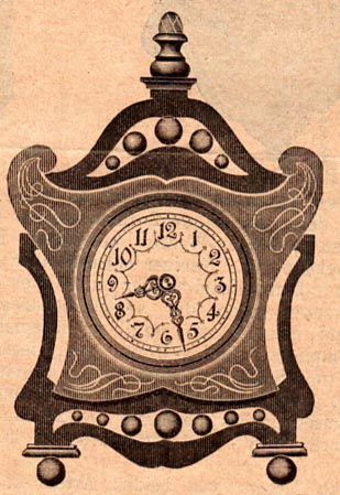
Nicely enough, almost as if he knew wed be looking at the drawings a century later, Schultz included a fifth clock for comparison, figure 15. A new model as well, it was of the previous genre with its familiar Historismus style shield of walnut, and tacked-on brass ornamental elements. Little space was given to describing the four Jugendstil clocks. It was only noted that they came in all shades of brown, as well as green, red and jacaranda-coloured, with the features and ornamentation in a gold-bronze. Each was available with any of three movements: a Schotten, a 30-hour, or an eight-day. What Schultz thought was very noteworthy was a more general observation, that a clock factory in this area (ie offering designs in the newest style) which was also working in the less-expensive genre could still offer such an extraordinary variety as was the case with these A Maier clocks. Then he happens across some clocks exhibited by one of the artists groups, and this sets him off on a spirited diatribe. He begins with a reference to the Kunst-Schriftstellernthose who write about artwho have often called out as a battlecry for a new style the demand that they have as simple as possible forms! He then gets into his full snide stride. Ive tried in the translation (below) to keep the rumbling syntax of this next long sentence, so take a deep mental breath before starting out. This demand must have been heard by the Vereinigten Werkstätten für Kunst im Handwerk in Munich [a famous art in handicraft workshop founded in 1898 by leading Munich modern designers Richard Riemerschmid and Hermann Obrist] which has exhibited [here in Paris] some table and wall clocks, whose forms certainly do show very simple lines, but of which one can say without exaggeration, when it comes to the cases, dials and even the handsas here apparently everything at any price should be original with few exceptions, that they can be described as the peak of tastelessness! Most of these monstrosities had already been seen at an exhibition in Munich of the Secessionisten artists group the previous summer, therefore we can greet them in Paris as old acquaintances. Only one of the monsters from then is missed, a description of which shouldnt be kept from our readers: One should think of an almost cube-shaped box of about 25cm to 35cm along its sides with an antique-brass coloured dial, set upon four thin almost straight legs about a 1.5m long, and the entire thing painted white, and one has the picture of a so-called Haus-Uhr [longcase] which rather gives the impression as though the body of a hippopotamus was placed upon the legs of a giraffe. After a few more snarky comments, Schultz explains to the duz readers why there are no drawings of these clocksindeed why we today cant view this horohippogiraffe. We had originally intended to illustrate a few of these [clocks], simply to show how remarkable they are. Then the consideration prevailed that this issue [of the duz] in 100 years will incorporate a bit of art history with it. So we certainly didnt want to help that type of Geschmacksverirrungen [aberrations from good taste] of our century to be immortalized ... Luckily, were told, he was close to another Black Forest exhibit, and it provided a more pleasant appearance. This was the small but selective collection of clocks from the Uhrenfabrik vormals L Furtwängler Söhne of Furtwangen in which every single piece seemed in harmony. Only two of the several clocks he describes were illustrated, figures 16 and 17. 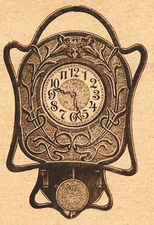
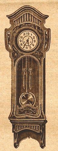
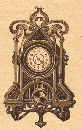
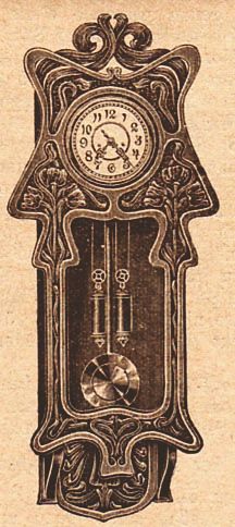
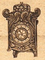
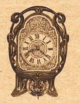
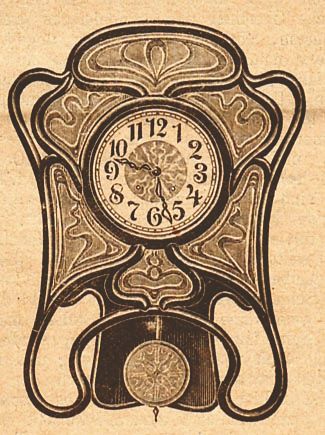
The excellent effects of the carving in both, he notes, do not come out well in drawings. This is especially true of the beautiful colour effects of the originals. The curved struts of the first are of mahogany, whereas the six inlayed pieces are in a natural, waxed walnut. The centre disk of the dial is in copper with a grey background, as is the pendulum bob. The outside strutting or surround of the second clock is also of mahogany, with the enclosed shield of walnut. The finely patterned background to the flowers is painted green, and the dial and the pendulum are copper coloured with a gold background. These colour combinations, he notes are chosen with taste. And perhaps with a last poke at those artists monstrosities, he points out that these types of models as seen here are evidence that our most modern style is also capable of taking pleasing and even noble art forms. He mentions some of the high-quality (separate) movements lfs were also exhibiting, then its on to Mauthes exhibits, the last of those which are illustrated in the duz. For whatever reason Mauthe as a manufacturer was given more attention than any of the others. Schultz mentions for instance the large selection of clocks that are produced just at the main factory, that 1100 to 1200 workers are employed in the three locations altogether, and that the daily production is 3000-4000 clocks. Among the clocks exhibited are again very many in Jugendstil. Five of them are illustrated, figures 18, 19, 20, 21 and 22. He found the freeswinger, figure 19, to be especially original as well as the weight regulator, figure 20, with its broad surfaces upon which tulips and lively curved leaf flourishes are carved. These five examples he concluded also give a good picture of the continuing developments of our new art form. And after a few final words about Mauthes clocks being available worldwide, hes done. Acknowledgments My appreciation to Earl Trevett for allowing his clock to be photographed, to Mike Wilson for taking the pictures, and to Chapter 28 of the nawcc for permission to reprint the illustration from their volume. Download a pdf of this article |
| © 1977 to 2015 Clocks Magazine & Splat Publishing Ltd |